Theo Mellon, Senior Art Intern
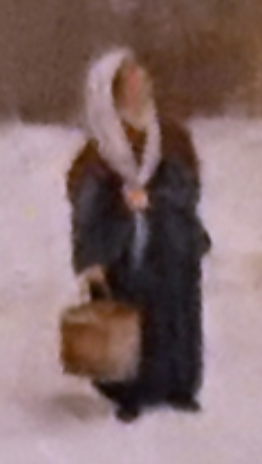
In 2018, we started on a project called Walking in Francis Guy’s Brooklyn. It was to be a VR alpha release game for Crystal Bridges Museum of American Art, supported with a small grant from them. Guests would be able to walk around the painting Winter Scene in Brooklyn by Francis Guy, as seen above. When we first started trying to tackle the character pipeline for our project, there were two concerns: realism and time. At the beginning, the alpha project art team consisted of the project lead and myself. With such a small team we decided, heck, why not go through the entire 3D character pipeline? The thought was, if we could make these characters in the painting come alive (i.e. realistic), then we would effectively create an immersive experience that would be compelling. When aiming at realism, however, there is a trap of landing in the Uncanny Valley: where a character is realistically human, but off enough to make the viewer uneasy. There are a lot of lighting and texturing tricks that developers use to create human characters that appear lifelike, while skirting the problem of the Uncanny Valley. This knowledge tends to come with experience, as strategies and workflows are discovered that are specific to a given studio and its projects. This was a new kind of project for our studio, and we didn't have time to develop a pipeline for "realistic" characters, especially for VR. We were stuck in this trap between ‘passable’ and ‘what can we add in the limited time remaining?’. The end result was janky: an experience that we wanted viewers to take seriously ended up in the Uncanny Valley because of several issues that, at the time, we couldn’t have foreseen.
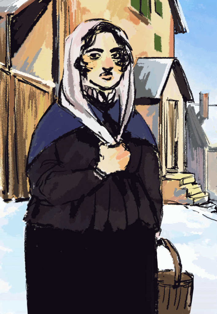
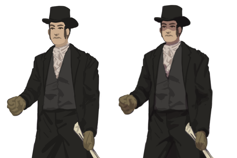
Walking in Francis Guy's Brooklyn is currently in full production, supported by an internal Chancellor's Grant from the University of Arkansas, with the deliverable of a playable Beta prototype. Given this, we’ve decided to take another direction: push Francis Guy’s art style and a painterly feeling more than realism. Now that production for A Winter Scene in Brooklyn has a bigger team and more resources, we can reflect and analyze what to improve from the alpha release, particularly for characters. We still want to have interactive characters that fit with the environment, but making 3D models for every person in the painting is unfeasible. During the alpha production we ran into several issues with various pipeline software; character models would have inhuman proportions, or our clothing would break the rigging system. It was frustrating, to say the least. Our solution is what I’m calling billboard 2.5D characters. Our Technical Director created a shader that allows a character to display the appropriate view in response to the player's viewing angle (a shader is code that defines how an asset is rendered onscreen). With the help of this shader, we could create a visual style for the characters that reflected Guy's technique. For now, most of the characters in the VR game will be in the style as seen to the left; we may or may not make changes later on, but it’s a good middle ground between Guy’s brushstroke-small characters and realistic 3D models. Before I could begin, the 2.5D characters required a lot of research, particularly for technical considerations, time-period accuracy, and our ability to match our art style to the painting. I’ll detail this process below.
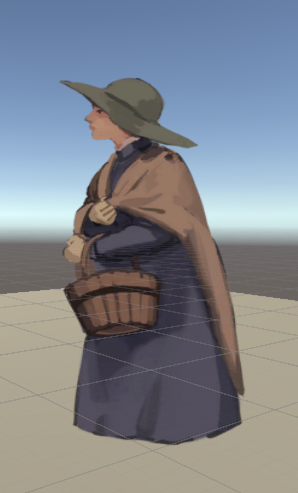
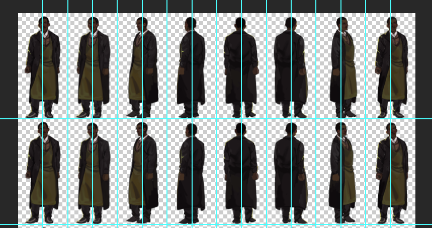
There are three levels of distance and detail that we’re considering for these characters: Interactive(close-up), Mid-ground, and Far-ground. Though the interactive characters should be consistent stylistically, they should be the most detailed, and feel the most believable. We settled on 8 different angles that a close-up character can be viewed from as the player walks around them. This means I’d have to create 8 frames or sprites for the characters to complete a turnaround. At each angle, the character can have a short animation. At minimum, they animate in the body, but for interactions, we can pass another material through the shader with facial animations. Mid-ground characters in general don’t need to animate; there may be a few with idle animations, but none are interactive. For far-ground characters we’re considering making a 2-4 sprite turnaround, but with a smaller viewable angle, since from far distances the player won’t be able to walk around them fully. For the shader to work in this way, the sprites for each viewing angle or frame should be placed on an equidistant grid. If this isn’t done, adjacent sprites will bleed into each other which is noticeable when the shader switches to another angle. For the sprites themselves, if there is an animation associated with the character, each angle can have a frame of animation that is expanded in the y-axis.
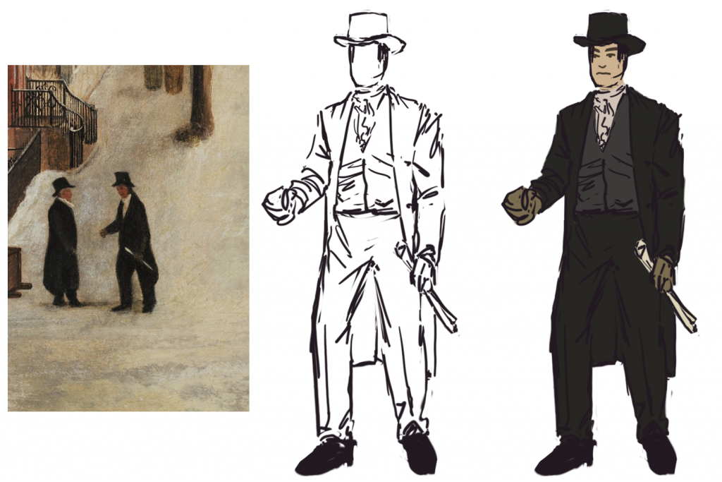
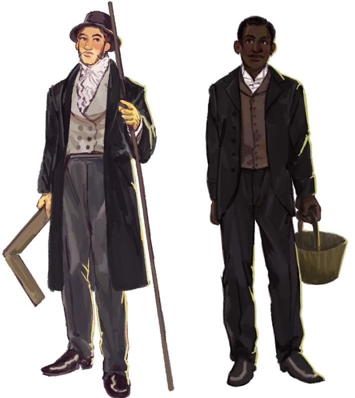
Through careful viewing of the painting and research into fashion in the early 19th century, I found a stark contrast in the clothing of the white versus the black characters. This is part of the larger compositional strategy of A Winter Scene in Brooklyn, serving to underscore differences in class and race. Generally wealth is shown by having more colorful and white clothes visible, particularly exaggerated dress shirts and collars. This helps convey that wealthier people wouldn’t have to take jobs that would stain or tear their clothing and could wear them without risk of long-term damage. Hats worn by white people would be generally taller and bigger-rimmed; often black people both in the painting and historical context would not have hats, a significant difference in comfort and health in a cold New York winter. White people would also be more likely to have fancy or high-quality gloves. From the references I gathered, there are two collars that one would wear day-to-day: the base shirt collar and a ruffled collar then tied around it, as seen on the white architect above.
Poorer people would not wear ruffles nor have a lower-cut/fancier vest to show them off. The assertions I’m making here are all broad generalizations meant to be guidelines when painting characters. While the scale of the painting does not allow this to be reflected in detail, clothing in this time is expensive and well-made, especially for the upper class. One would buy a coat and expect it to last for a good 40-50 years; it would have been hand-made, and therefore tailored to the person who ordered it. A majority of the clothing would have been very well-fitting. Francis Guy’s earlier profession as a silk dyer provides interesting context for the clothing seen in the painting. As he was knowledgeable of 1800’s fashion, to what degree did he use this to reflect race and class? Throughout the process, I used these questions as guides to help shape and support our overall vision in trying to tackle how the characters look and feel. Hopefully as I expand this research, I can help in making more accurate and resonant stories.
Finally, to tackle how to match our game’s art style to the painting I created a workflow with the following considerations: color, contrast, and legibility. These considerations were balanced based on careful analysis of the painting and game play goals. Color plays a large part in both the style of the painting and believability of the characters and setting. All characters have an overall warm palette to match the environment. From this, I took liberties in stylizing character looks given that they would also need to stand out. Up close, characters should have smoother folds and saturated highlights to give a more lively feel. Contrasting cool suits/dresses with warm lighting makes the clothes feel both fancy and worn. Most of the characters are based on the figures represented in the painting, and with this as a reference, combined with historical research, I would compose the first sketch. The sketch is at a flat angle instead of upwards to convey grounded characters. To keep character styles consistent with the painting but simple for fast iteration, there’s a lot of color blocking with color-matching from the painting. I tend to use a lot of color variation and lower saturations to replicate the inconsistencies of oil painting. In the actual painting, the faces are simple. They’re at such tiny detail that it’s difficult to make them look natural. Given this, I decided to make faces that are very simple: I think of Nintendo’s “Mii”s in terms of detail. At further distances, I keep a lot of hard edges and creases intact so shapes and clothing can read well.
As production continues on Walking in Francis Guy's Brooklyn, this workflow will no doubt change and improve as we head toward our beta prototype build. Art decisions are particularly important given that this is based on a painting that is 200 years old. I think the painting has an important story to tell regarding the racial and social history of America. Going forward, I hope to share more of what we find and to create a beautiful and impactful game.


